/PROJECT 07 · LEGACY WEB2 PROJECT
Flexchange Website
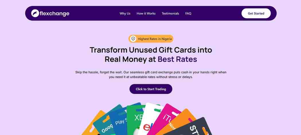
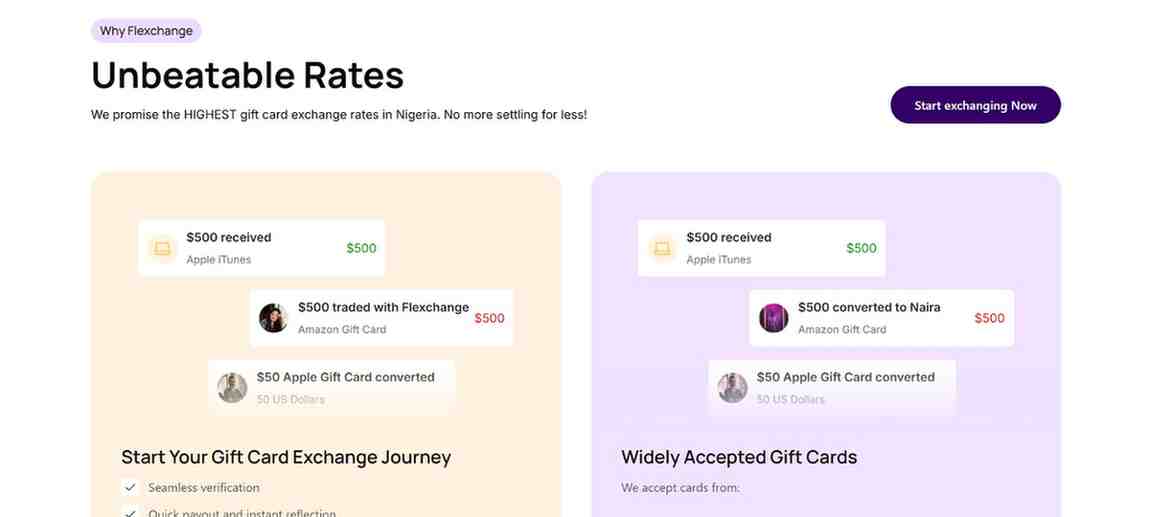
Flexchange is a high-conversion marketing website for a Nigerian gift card exchange platform. Built with Next.js 15 and Tailwind CSS, it showcases seamless onboarding flows, persuasive copy, and a modal-based trade initiation system. The site highlights benefits like unbeatable rates, customer testimonials, and a simple three-step process to guide users from interest to trade execution.
/GOAL
Preserve the useful product context from Flexchange Website while keeping the project independently reviewable.
/STACK
Technologies used
/ARCHITECTURE
How it is built
- Interface — Public experienceLegacy interface and interaction surface imported as portfolio evidence.
- Project context — Product narrativeImported project details and feature notes remain editable in the owner workspace.
- Review boundary — Responsible scopeThe imported record is a draft and requires owner review before public publication.
/SCOPE
What was delivered
- Card & Platform Modal: Built with Radix Dialog and Context API, the modal allows users to select card types and trading platforms (like WhatsApp) with dynamic CTA generation.
- Persuasive Copywriting: Landing content is structured around trust, speed, and rates — the three key decision drivers for gift card users in Nigeria.
- Interactive Testimonial Carousel: Social proof slider builds trust using Embla Carousel integration and reusable components.
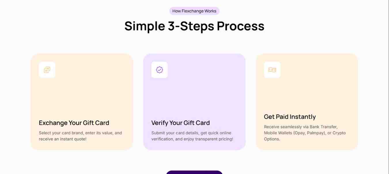
- Step-by-Step Flow: Users are guided through a 3-step trade process using icon-driven visual sections.
- FAQ Accordion: Radix UI Accordion used for a clean and responsive FAQ section with smooth animations.
- Mobile-First and Fully Responsive: Optimized layout for mobile devices using Tailwind utilities and responsive component scaling.
- Auto-Snap Trade Modals: Scrollbar-aware modal opens with body lock and padding shift to prevent layout shift, ensuring optimal UX.
- Clean Animations: Uses `tw-animate-css` for consistent entrance and hover effects across key components.
/NOTES
Scope boundaries
Imported legacy content is an unverified portfolio draft. Review claims, links, project ownership, and visual evidence before publishing.
/GALLERY
Screens
/MORE_WORK